The Psychology Behind Choosing Saturation Levels
Saturation, in the context of color theory, refers to the intensity or purity of a color. Highly saturated colors are vivid and vibrant, while low-saturation colors appear muted or washed out. While saturation is a basic element of visual design, its psychological effects are profound, influencing perception, emotion, and even behavior. The choice of saturation level is rarely arbitrary; designers, marketers, and artists manipulate saturation intentionally to guide attention, evoke emotions, and create atmospheres. Understanding the psychology behind these choices requires examining how the human brain perceives color and how it interacts with mood, context, and cultural associations.
The human visual system is highly sensitive to saturation changes, especially when comparing adjacent colors. Highly saturated colors tend to attract attention and create a sense of immediacy, which is why they are frequently used in advertising and safety signage. Bright reds, vivid blues, and neon greens evoke strong physiological responses, including increased heart rate and heightened alertness. Conversely, desaturated colors often evoke calmness, subtlety, or nostalgia. Designers of luxury brands, for example, often favor muted tones to suggest elegance and refinement, demonstrating that saturation can convey complex psychological messages beyond mere visibility.
Saturation also affects perceived space and form. In visual composition, highly saturated colors appear closer to the viewer, while desaturated colors seem to recede. This perception can guide attention hierarchies, highlight focal points, or create depth in two-dimensional designs. For instance, in film and photography, directors often desaturate background elements to ensure that the subject stands out, subtly manipulating viewers’ focus without explicit cues. In marketing, product images with high saturation can make items appear more appealing and desirable, while desaturation can suggest subtlety or understated sophistication. These effects are rooted in the neurological response to color stimuli, emphasizing why saturation is more than an aesthetic choice—it is a tool that communicates subconsciously.
Cultural context also interacts with saturation perception. While high saturation is generally associated with excitement and energy in Western cultures, some cultures interpret bright colors differently. For example, highly saturated red can evoke luck and celebration in East Asian traditions, whereas it may signify warning or danger in Western contexts. Similarly, muted earth tones may suggest rustic simplicity or environmental consciousness depending on cultural frameworks. Designers who consider these nuances leverage saturation as a psychological lever, ensuring that their color choices resonate with the intended audience both emotionally and cognitively.

Emotional and Behavioral Responses to Saturation
One of the most compelling reasons saturation matters in design is its influence on emotion and behavior. Colors with high saturation levels tend to elicit stronger emotional responses than muted colors, making them powerful tools in shaping mood. High saturation is commonly linked to excitement, energy, and urgency, which is why fast-food brands, video game covers, and sports marketing often utilize brightly saturated reds, oranges, and yellows. These colors not only capture attention but also trigger dopamine-mediated reward pathways, enhancing the viewer’s engagement and impulsive responses.
In contrast, low-saturation colors are associated with calmness, introspection, and sophistication. Designers of luxury goods, corporate branding, and wellness products often favor muted palettes to convey stability, professionalism, or relaxation. For instance, a spa’s visual identity might employ desaturated greens, soft blues, and beige tones to induce a sense of tranquility, promoting a subconscious expectation of peace and rejuvenation. This deliberate choice influences behavior subtly; customers exposed to desaturated environments may linger longer, feel more relaxed, and be more receptive to persuasive messaging compared to environments dominated by highly saturated, high-energy colors.
Saturation also interacts with cognitive load and information processing. Highly saturated colors can increase visual stimulation, which is advantageous when attention capture is desired, such as in notifications or warning signals. However, overuse of saturation can lead to visual fatigue or distraction, impairing comprehension and focus. Desaturated colors, conversely, reduce cognitive load and facilitate sustained attention, which is why muted tones are often used in dashboards, educational materials, and professional presentations. The psychology of saturation, therefore, is not merely about aesthetics—it is about optimizing human perception for emotional and functional outcomes.
Moreover, saturation levels can influence social and identity perception. Research in color psychology suggests that environments or objects featuring bright, saturated colors are often associated with youthfulness, playfulness, and creativity. Low-saturation colors, meanwhile, convey seriousness, maturity, and sophistication. Brands strategically manipulate saturation to align with the desired identity: a technology startup targeting creative professionals might employ vibrant, saturated colors to signal innovation, while a financial institution may rely on muted tones to suggest stability and trustworthiness. Understanding these associations is crucial for designers seeking to influence audience perception through subtle yet powerful visual cues.
Saturation in Marketing and Branding
In marketing, the psychology of saturation plays a central role in shaping consumer perception and behavior. Highly saturated imagery often signals urgency, importance, or desirability, making it ideal for calls to action, limited-time offers, and product highlights. For example, e-commerce platforms frequently use bright, saturated colors for “Buy Now” buttons because they naturally draw attention and prompt clicks. Similarly, promotional posters and advertisements leverage saturation strategically to maximize visual impact in cluttered environments, ensuring that their messages stand out among competing stimuli.
Conversely, brands that seek to communicate refinement, trust, or luxury often favor low-saturation, sophisticated palettes. Companies like Apple and Chanel employ muted tones in product photography and branding to create an impression of elegance and exclusivity. Saturation manipulation in this context serves as a psychological cue, signaling that the product or service is thoughtfully designed, high-quality, and worthy of premium investment. The contrast between high- and low-saturation strategies highlights how critical it is for marketers to consider psychological implications when designing visual campaigns.
Saturation also affects brand consistency and recognition. Consistent use of saturation levels across various touchpoints—from packaging to social media—reinforces brand identity and emotional resonance. Highly saturated brand colors can become iconic, such as Coca-Cola’s red or Tiffany & Co.’s robin’s-egg blue. Conversely, desaturated palettes help maintain a calm, understated identity that communicates reliability and professionalism. In both cases, psychological consistency strengthens consumer trust and engagement, demonstrating the subtle yet powerful role saturation plays in branding strategy.
Another critical aspect is the relationship between saturation and perceived value. Research shows that consumers often associate muted colors with premium or artisanal products, while overly bright or saturated colors can suggest mass production or lower quality. This perception affects willingness to pay, purchase intention, and brand loyalty. By understanding the psychological effects of saturation, marketers can strategically position products and services in the minds of consumers, aligning visual presentation with desired emotional and behavioral responses.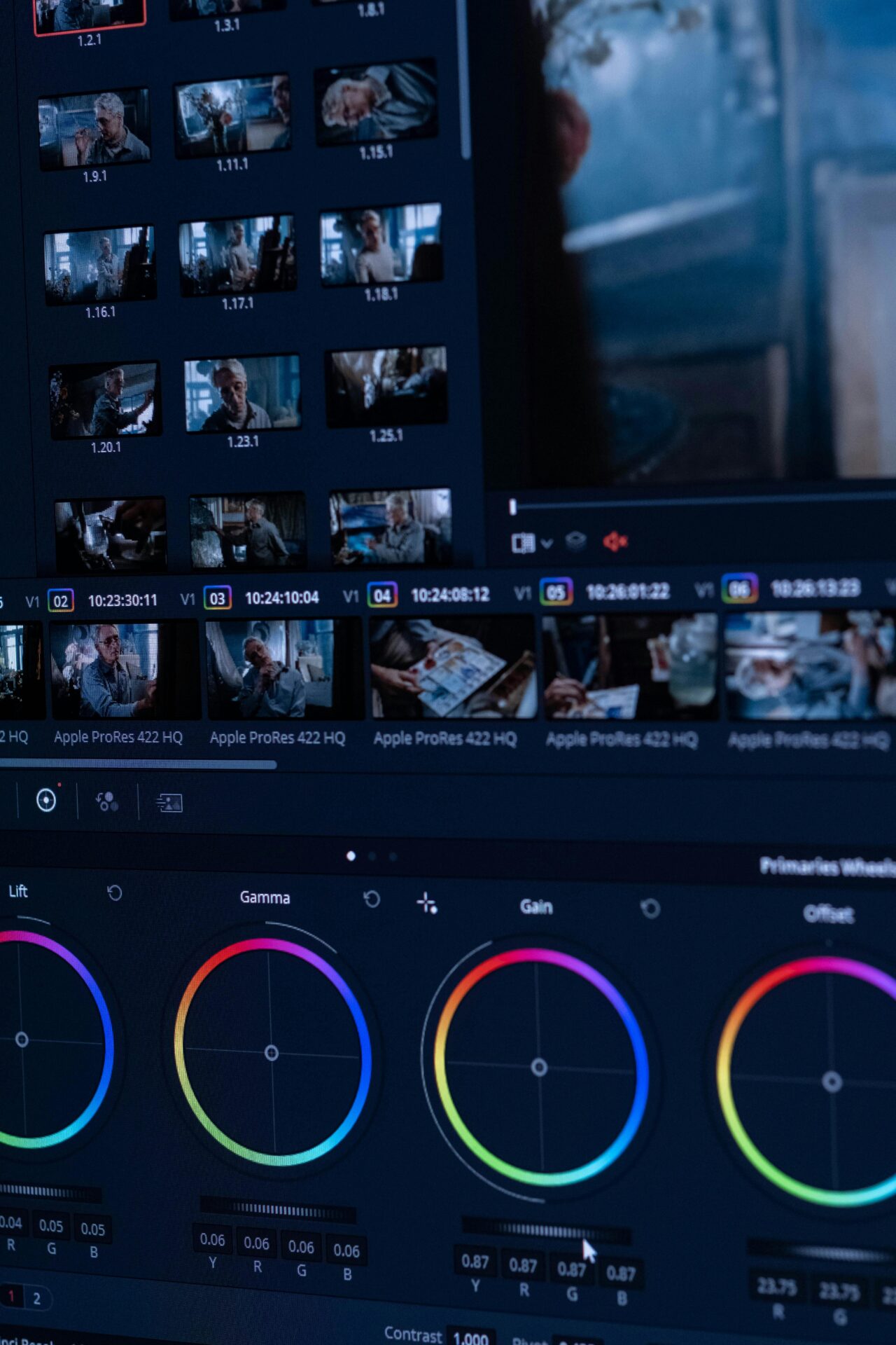
Practical Guidelines for Choosing Saturation
While the psychological principles of saturation are clear, applying them effectively requires nuanced understanding and context-specific decision-making. High saturation should be employed when the goal is immediate attention, excitement, or energy, but it must be balanced to avoid overwhelming the viewer. Low saturation is effective for calmness, sophistication, and focus, yet overuse may lead to visual monotony or diminished engagement. The key is to align saturation choices with emotional goals, functional objectives, and cultural considerations.
Another important guideline is to consider contrast in saturation, not just absolute levels. Pairing a highly saturated element with muted surroundings can enhance attention and emphasize hierarchy. This principle is widely used in web design, advertising, and cinematography, where selective saturation guides the viewer’s focus and communicates narrative or functional importance. For instance, a single saturated object in an otherwise desaturated frame immediately captures attention, creating a visual anchor that drives engagement and comprehension. Understanding how saturation interacts with contrast allows designers to manipulate perception deliberately, rather than relying solely on color hue or brightness.
Designers should also consider audience, context, and medium. Children’s media often employs highly saturated, playful colors to evoke joy and curiosity, whereas professional interfaces for adults may favor muted palettes to enhance readability and reduce cognitive strain. Environmental factors, such as ambient lighting and adjacent colors, also influence perceived saturation, underscoring the importance of context-aware design. Ultimately, the most effective use of saturation requires an integration of psychological insight, visual literacy, and strategic intent, ensuring that color choices reinforce both aesthetic and functional goals.
The psychology behind choosing saturation levels is a rich and multifaceted field. From emotional response to behavioral influence, from marketing strategy to environmental design, saturation is a powerful tool that communicates far beyond aesthetics. By understanding how humans perceive and react to saturation, designers can craft visual experiences that are engaging, meaningful, and emotionally resonant. Whether through the high-energy impact of vivid colors or the calm sophistication of muted tones, the deliberate manipulation of saturation continues to shape perception, guide attention, and influence behavior across media, physical spaces, and digital environments.